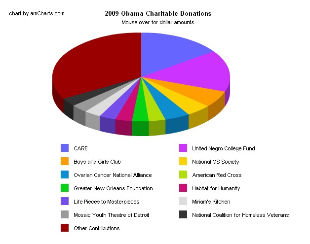
While we all agree that pie charts can be useful, I noticed on AOL's "The Grid-News by the Numbers", a pie chart breaking down Obama's charitable donations. There were 13 slices of the pie, which made it too much cognitive work to match the colors to the slices, not to mention trying to decipher the differences between a slice that represents 3.04% of the whole and a slice that represents 4.0%. I think a bar chart would have been much more visually effective.
http://www.aolnews.com/the-grid/article/tax-return-shows-obama-familys-favorite-charities/19443320
No comments:
Post a Comment